


Free PMP Certification Practice Questions:
 Which of the following is the MOST effective tool to observe trends and results over a specified period of time?
A) Control Chart
B) Run Chart
C) Gantt Chart
D) Scatter Diagram
-
[Ans: B]
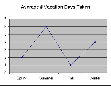
A run chart is a line graph that shows how a variable changes over a specified period of time. For example, a run chart may show the seasonal period where employees take the most vacation days off.
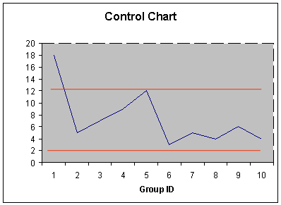
On the other hand, a control chart illustrates a chart with upper and lower control limits on which values of some statistical measure for a series of samples or subgroups are plotted. For example, a control chart may chart the volatility of a stock.
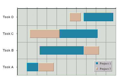
In contrast, a Gantt chart is a graphic display of the duration of a set of activities in a project's cycle.
Finally, a scatter diagram is a graph that shows the relationship between two variables by showing individual results on the x axis and y axis as each incrementally changes. For example, an organization might evaluate the correlation between their increasing stock price and turnover rates to determine the value of options to employees.

BACK | NEXT